Why is Color Knowledge Important in Photography?
In the age of digital there is a real lack of understanding about color in photography. It’s not surprising, as photographers are creative people, not technical people.
Knowing how to deal with and manage color all the way from capture to print is not as easy as one would imagine. In fact, there used to be professionals specialised in preparing a digital file to work with a printing process to produce an accurate print.
But with the race for the lowest price, even professional labs no longer hire someone with the skills for this role. What used to be in the realm of professional printers has now become the job of the photographer. And it is no wonder that many photographers would rather not provide prints at all.
Today we’ll go explain some of the challenges in producing a beautiful printed photograph.
Monitor variation
Many people are not aware that not all monitors are the same. In fact, even different monitors of the same brand and model are not the same. Several things vary with a monitor’s age and environment:
- range of colors it can display (can it show the darkest to most vibrant red, or only from a dull red to another dull red?)
- how accurately it can show a color (if I ask for navy blue, will it show anything from cobalt to azure depending on the day?)
- how accurately it can show brightness (can I tell the difference between 1% and 5% brightness grey, or does everything from 1-10% look the same?)
- can do all of the above across the whole screen (most monitors are brighter in the middle than the edges!)
- how many colors can it display at once (yes, some monitors start grouping colors together when there are too many!)
These are issues that plague digital photography. What does this mean to you?
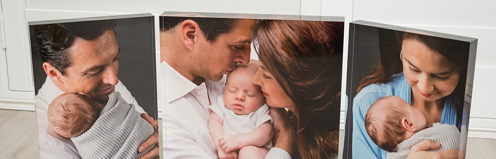
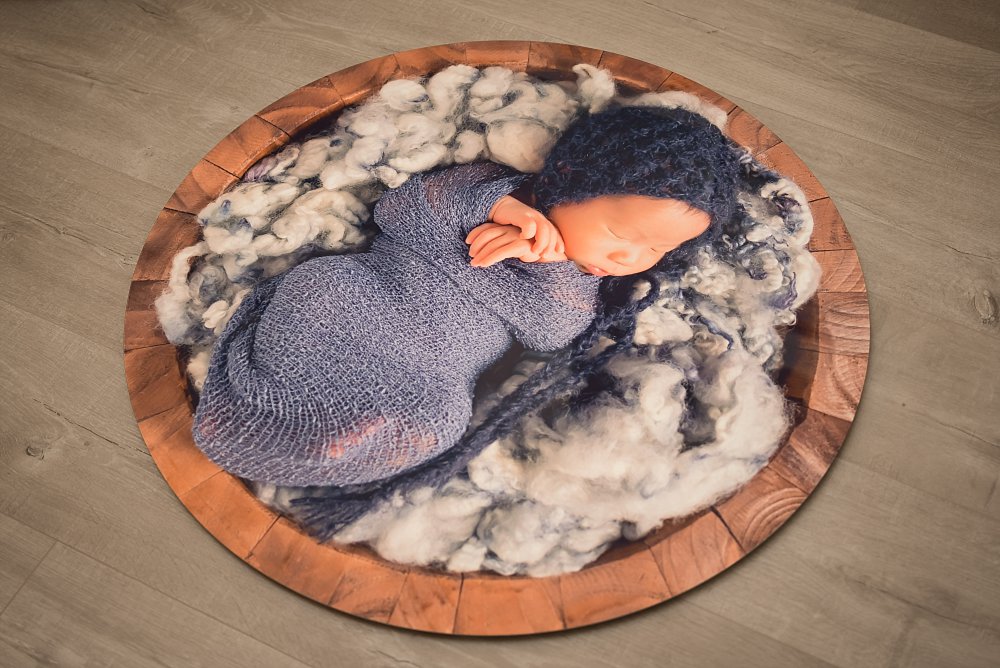
A beautiful baby photograph to me may look like a purple baby to you. Or vice versa. Who’s right? You won’t know until it’s printed – and only if you have a reliable printer. Maybe this is why some photographers use a lot of filters, so the colours are fake anyway…

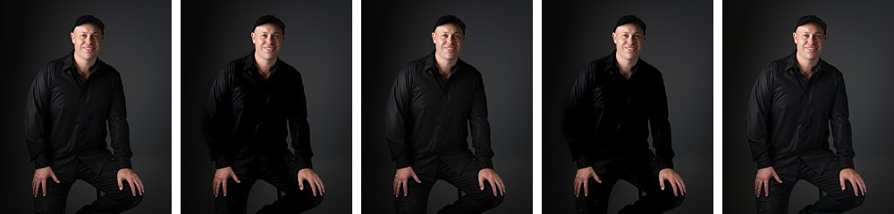
You never know what to do with blacks, does it look too bright, or is it lost in a black hole? Can you see the texture and the details? Look at the man’s shirt, in some shots you can see all the details in sum it’s just a solid block of black.
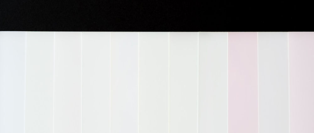
It’s even worse with whites! Will you get some invisible details when it’s printed? Will you get blocks and banding there?
More often than not the effects are more subtle than what I’ve shown here. Because even if your monitor is green, your eyes get used to it and compensate. If I showed you those 5 babies one at a time, they would all probably look perfectly fine! Your retail labs also have variations in their color printing, so chances are you keep complaining and getting reprints with until a happy accident gives you an acceptable print.
Monitor calibration – cure all?
The above are just some of the most simple issues with color management, and most professional photographers should have a good quality calibrated monitor to deal with them. So is a good monitor and calibration going to solve all your issues with printing? Sadly no.
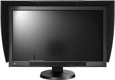
Search on google about Monitor calibration, and you’ll get 170 million results. It’s a serious (and confused) topic! Yes calibration will help a bit. It will tell you what is red and what is blue, and higher end calibrators will even tell you how to adjust your brightness. But a bad monitor is always going to vary and be limited in what it can display. That’s why you can buy a 32″ monitor for $199, and a 27″ monitor for $4585. And why the latter sells so well to visual professionals.
Even calibration you have to calibrate it to the right standard, and use the same standard from capture of the photograph all through the editing process to the printing. Eg it’s no good building a rocket when one engineer uses inches and the other uses centimetres.
Some photographers think that they buy a monitor that claims to show 100% of the ARGB gamut, then everything they do is perfect. Again the devil is in the details. maybe the monitor can show every single colour, but when you tell it to show a mint green it shows you a neon green. Or it can only show you accurately after being warmed up for two hours. There is no shortcut for knowledge.
Conclusion
I hope this explains to you why seasoned photographers take a lot of time to prepare your photographs. We’ve compressed years of learning and experience into our workflow and we can’t explain it in an email.
It’s also almost impossible to recommend a retail printer. They simply don’t have any consistency. Professional printers do not want to deal with retail customers because they don’t want to deal with explaining years of colour theory in an email to an angry customer with improperly prepared files.
Retail are there to give you something that is good enough for a low “no brainer” price. It’s not really possible to ask for a high quality result which would take them 5 times as long to print and check.
Valent Lau provides Child and Family Photography in Sydney. Contact us now and take your first step towards creating some beautiful heirlooms.

Get 5 Pro Tips to Have the Best Newborn and Pregnancy Photos Ever
Creating gorgeous photographs of your pregnancy and new child is a must… Get this free booklet with tips on how to truly shine and get amazing photos, guaranteed.